Work Experience Contact

Mohammad Mannaa

"Good design is as little design as possible."

Art Director — 13+ Years

Scroll

Art Director — Dubai

Mohammad
Mannaa

Connecting both worlds of design business and business. design.

13+ Years of Experience and counting.

Art Direction Branding Identity UI / UX Creative Lead Dubai 13+ Years Visual Identity MENA Motion Strategy Art Direction Branding Identity UI / UX Creative Lead Dubai 13+ Years Visual Identity MENA Motion Strategy
Watch Reel ↗

2025 — Present

50-Three

Head of Digital

Leading the full creative and digital function — from brand strategy and identity to product design and delivery. Overseeing creative output, managing commercial relationships, and setting the design direction for a Dubai-based creative studio.

Creative Direction Digital Strategy Brand Management Team Leadership

Dubai, UAE

2019 — 2024

Najahi Events

Associate Creative Director

Driving all creative and visual direction for the GCC's leading live events and entertainment company — covering large-scale productions, brand activations, and event campaigns from concept through execution.

Art Direction Events Brand Activation Visual Identity

Dubai, UAE

Jul — Nov 2023

Abu Dhabi TAMM

Art Director

Contracted via NimDigital to lead art direction for one of Abu Dhabi's flagship government digital platforms — producing illustration, graphic design, and visual systems aligned with national identity standards.

Illustration Art Direction Government Digital

Abu Dhabi, UAE

Let's make
something
worth seeing.

Care n Tour — Medical Tourism Brand Identity

2025 · Medical Tourism · Egypt

Care n Tour

My Role Brand Identity Designer · Art Director
Client CareNTour — Medical Tourism Provider, Egypt
Disciplines
Brand Identity Logo Design Art Direction Visual Design

CareNTour is a premier medical tourism provider based in Egypt, combining world-class healthcare with the richness of Egyptian hospitality and culture. The brand needed to communicate trust, warmth, and international credibility — making patients feel confident about choosing Egypt for life-changing medical experiences. Healing here isn't just a procedure; it's a journey.

01

The Challenge

Medical tourism brands live or die by trust. The visual identity had to balance clinical credibility with human warmth — signalling expertise without coldness, and luxury without alienating patients who are often anxious about medical decisions abroad. It also needed to hold its own in an international context while feeling authentically Egyptian.

01

Trust at First Glance

Patients researching medical tourism make snap judgments. The brand needed to project professionalism and safety before a single word was read.

02

Healthcare + Hospitality

Blending two distinct sectors — medical precision and travel warmth — into a single cohesive identity without either feeling diluted.

03

International Reach

The brand needed to resonate with patients from across the MENA region and beyond — culturally grounded but universally legible.

02

Brand Identity

The visual system anchors on a mark that fuses the idea of care — the human, the medical — with movement and journey. The palette balances clinical cleanliness with warmth. Every touchpoint was designed to make a nervous patient feel held.

Logo System Color Palette Typography Brand Guidelines Stationery Digital Assets
03

Applications

The identity was rolled out across stationery, digital touchpoints, and collateral — tested across both luxury and clinical contexts to ensure it held in every environment a patient or partner might encounter it.

Next Project
50Three — Social Media & Campaign Creative System

Social Media · Paid Ads · Campaign Creative

50Three —
Not Just Posts.
A Content Engine.

My Role Creative Director · Campaign Designer · Art Director
Client 50Three — Creative & Digital Studio
Disciplines
Social Media Paid Ads Campaign Design Brand Awareness Bilingual EN + AR

50Three is a creative and digital studio. The objective was to build a complete social media presence that would attract new leads, generate brand awareness, and establish 50Three as a serious creative force in the market. The approach: group the creatives by intent — not by format. Awareness content, conversion-led paid ads, event campaigns, and bilingual outreach, all built as one connected content ecosystem.

30+Campaign visuals across paid & organic
4Creative territories by intent
MultiFormat — feed, stories, ads, banners
EN+ARBilingual visual communication
01

Creative Direction — Bold, Fast, Memorable

The visual language was built around high-contrast typography, rich conceptual imagery, punchy hooks and platform-first composition. Every post had to communicate in one second — no slow builds, no visual noise. The system was designed to make 50Three look like the most interesting brand in any feed it appeared in.

Scroll-Stopping Hooks

Big statements that communicate immediately — the headline does the stopping, the visual does the feeling.

AI-Enhanced Visuals

Conceptual AI-generated imagery creates immediate campaign recall — unexpected, high production quality, unmistakably 50Three.

Brand-Led Consistency

Repeated color (electric blue + yellow), typography hierarchy and layout cues across every post — recognition before a logo is needed.

02

Brand Awareness at Scale

The Blu series is the core brand awareness territory — a consistent visual system built on deep electric blue, bold typography, and conceptual 3D/AI imagery. Each post carries a different message but shares the same unmistakable DNA. Together they function as a campaign wall: range, consistency, and concept strength at a glance.

Going Above & Beyond
Creativity Takes Many Forms
AI Isn't Coming
Content Is King
End-to-End Creative Solutions
Packaging and Presenting
Going Above & Beyond Creativity Takes Many Forms AI Isn't Coming — It's Already Here Content Is King End-to-End Solutions It All Comes Down to How You Present It
03

From Attention to Action

Conversion-led creatives work best when shown inside their intended environment — hook, visual, message, and CTA together. These posts were designed to stop the scroll and immediately communicate what 50Three does and why it matters to a potential client. High-contrast, clear value proposition, one idea per post.

The Art of Visual Storytelling
Bring Your Brand to Life
Pushing Boundaries
The Art of Visual Storytelling Bring Your Brand to Life Pushing Boundaries
04

Pattern Interrupt

The "weird" territory is intentionally unconventional — minimal, conceptual, and stripped of the usual social media language. These posts work differently from the Blu series: no electric blue, no big branding, just an unexpected visual idea and a sharp line. They exist to create curiosity and make the audience stop because something looks different — then read. A bitten apple that says "RECOGNIZED". A faceless brand that asks if you'd trust it. A grow-your-business post built entirely out of type.

Your Brand Deserves to Be Recognized
It's Hard to Trust a Faceless Brand
Grow Your Business
Screen Time
Template
Recognized — Bitten Apple Faceless Brand Grow Your Business Screen Time It's Not Luck
05

Bilingual Market Reach

The Arabic content was built to serve the Arabic-speaking market in the UAE and wider MENA region — not simply translated, but reframed. The visual design shifts to accommodate RTL reading direction while keeping the same bold typographic confidence. The two posts target brand identity and creative partnership — both relevant entry points for Arabic-speaking clients discovering 50Three.

Arabic branding post
Arabic creative partnership post
Arabic Brand Identity Post Arabic Creative Partnership Post RTL Typography System EN + AR Visual Parity

The Full System

Thirty-plus creatives. Four territories. One cohesive brand voice. The complete campaign output — not a post dump, but a performance-led creative system built to generate leads, build awareness, and make 50Three impossible to ignore.

50Three — full campaign creative system
Next Project
Najahi Events — 5 Year Creative Journey

2019 — 2024 · Dubai, UAE

The Najahi Journey

My Role Art Director / Associate Creative Director
Duration 5 Years
2019 — Present
Disciplines
Art Direction Brand Identity UI / UX Social Media Video Storyboards Email Marketing Offline Collateral Rebranding

Najahi is one of the GCC's leading platforms for personal and professional development — hosting world-class speakers, mega events, and intimate workshops across the MENA region. Over five years, I led the entire creative output: from rebranding the company and its sub-brands, to designing every digital touchpoint, every event campaign, and every visual that reached their audience. This is the story of building a creative system that scaled with a company at full speed.

300+ Unique landing pages designed over 4 years
77% Peak landing page conversion rate achieved
5 Years as sole Art Director across all touchpoints
Events, speakers, campaigns — every one designed in-house
01

The Challenge

Najahi was growing fast — but its brand wasn't keeping up. The visual identity was inconsistent across channels, the digital presence felt dated, and nothing communicated the calibre of what they were delivering: world-class speakers, transformative experiences, and a genuine community. The challenge wasn't just aesthetic. It was building a creative infrastructure that could move at the speed of a live events company.

01

Fragmented Identity

No unified visual language across digital and physical touchpoints. Every campaign felt like it came from a different brand.

02

Scale & Speed

Hundreds of events per year, each needing its own full campaign — landing pages, social content, collateral, video assets — with tight deadlines.

03

No Design System

Without a solid foundation, every project started from scratch. The goal was to build something that would compound — getting faster and better over time.

02

Brand Reidentity

The first major project was a complete rebrand — not just a new logo, but a full visual and strategic framework. The new identity, built around the concept of "The Najahi Journey," captures the movement from aspiration to achievement. Clean, modern, and human at its core.

Logo System Color Palette Typography Brand Guidelines Sub-brand Architecture Iconography
03

Digital — Website & 300+ Landing Pages

The core website was redesigned to be people-centric — putting faces, names, and stories front and centre. But the real volume was in the landing pages: over 300 unique pages designed across 4 years, each tailored to its event's size, audience, and goal. The best-performing page achieved a 77% conversion rate.

"Over a 4-year period, we created 300+ unique landing pages for events of all sizes — from mega events to intimate workshops. The best result: a landing page that achieved an exceptional 77% conversion rate."

Company Website 300+ Event Landing Pages Ticket Sales UX Lead Generation Pages Speaker Profile Pages
04

Event Campaigns & Social Media

Every event was its own visual world — its own colour story, its own typographic voice, its own set of assets across Instagram, email, outdoor, and print. Art directing the full campaign from brief to delivery, across digital and offline channels simultaneously.

Campaign Art Direction Social Media Visuals Email Marketing Design Promo Video Storyboards Outdoor & Print Collateral Event Signage Systems
05

What This Work Says About Me

Five years at Najahi wasn't just output — it was building creative infrastructure. Every system I built made the next campaign faster. Every brand decision I made had to survive a hundred applications. This is what I bring to any team: not just design, but design thinking that compounds.

Hands-on + Strategic

I designed everything myself while also setting direction — from pixel-level execution to high-level creative strategy.

Built to Scale

300+ landing pages, one consistent brand. I created systems that let quality scale without the usual trade-offs.

Results-Driven

77% conversion rate. Not luck — a result of understanding the relationship between design decisions and business outcomes.

Next Project
GITEX 2023 Abu Dhabi Pavilion

October 2023 · Dubai, UAE · 3 Weeks

GITEX 2023
Abu Dhabi Pavilion

My Role Art Director · Creative Lead · Storyboard Director
Timeline ~3 weeks brief to delivery
Disciplines
Art Direction Concept Development Storyboarding Motion Direction Pitch Decks Creative Coordination Graphic Design

GITEX is one of the world's largest technology events. The Abu Dhabi government needed a pavilion that didn't just display data — it needed to feel like a glimpse of the future. A 60-metre-wide, 6-metre-tall triple-screen installation, a custom 3D arc reactor on physical pillars, and three distinct cinematic experiences — all conceived, storyboarded, pitched, and delivered in under three weeks. Creative. Fast. Thorough. All at once.

60m Wide installation spanning three linked screens
3 Distinct cinematic experiences designed and delivered
~3wk From brief to final delivery at the world's largest tech event
Viewing angles — content designed to work from anywhere
GITEX 2023 — Live Event Footage · Abu Dhabi Pavilion
01

The Installation Challenge

This wasn't a standard screen. The pavilion was a 60-metre-wide, 6-metre-tall environment: two curved side screens mirroring each other, one central screen, and physical 3D pillars standing between them. The content had to flow seamlessly across all three, with the pillars acting as visual bridges — not interruptions. And it had to work from every angle. Someone standing to the far left saw a different composition than someone standing centre, but both experiences had to be equally immersive and coherent.

60m · Three-Screen Installation — Abu Dhabi Pavilion

Side Screen
Centre Screen
Side Screen

Visual continuity across all screens — content synced to 3D pillar pulses

60m

Continuity

The visual story had to flow seamlessly from left screen through pillars to right screen — a single narrative across a 60-metre canvas.

∞°

Perspective Independence

Whether someone stood at a side screen or dead centre, the content had to be immersive and coherent. No "wrong angle."

~3w

Speed

From brief to live installation in approximately three weeks. Research, concept, storyboard, pitch, revise, deliver.

02

How I Worked — Process Under Pressure

The brief arrived and the clock started. There was no time for extended research phases or iterative concepting. Everything had to happen in parallel — researching Abu Dhabi's smart city narrative while sketching concepts, while preparing pitches for client approval, while directing the motion team who were already animating the first approved assets. This is what high-speed creative production looks like from the inside.

01

Research & Brief

Rapid immersion in Abu Dhabi's digital transformation narrative, TAMM platform stats, and government entity data.

02

Concept & Storyboard

Developed three distinct visual concepts simultaneously — TAMM in Numbers, Entities Infographic, and the Cinematic Film.

03

Pitch Decks

Designed client-facing pitch decks for each concept. Visual enough to sell the idea, precise enough to brief the animators.

04

Motion Direction

Coordinated motion designers and 3D animators, providing frame-by-frame direction, feedback loops, and real-time corrections.

05

QA & Delivery

Final review for cross-screen continuity, pillar sync, and perspective independence before live installation.

03

TAMM in Numbers

The TAMM logo radiates powerful beams of light — branches that symbolise the platform's vast reach across government services. Statistics emerge along the light trails, carried on flows of data. The concept: the numbers don't just sit on screen — they travel through the system, the way TAMM connects services to citizens.

Concept Storyboard Art Direction Motion Direction Infographic Design
TAMM in Numbers — Animation
04

Entities Infographic — Living Digital Canvas

An ambient, continuously looping experience. A stylised Abu Dhabi cityscape "goes digital" as waves of electrical pulses travel across the skyline. At precise intervals, pulses illuminate government entity data — visitors absorb information without being lectured to. Information as atmosphere. The 3D arc reactor on the physical pillars was designed to be the visible source of these pulses, timed to sync perfectly with the screen animation.

Concept Storyboard 3D Pillar Brief Sync Coordination Art Direction
Electrical Pulse — Side Screen Sample
05

The Cinematic Film — Government of the Future

The central question: "What does the government of the future look like?" The film answers it through a blend of futuristic imagery and iconic Abu Dhabi scenes, narrated with the authority of a government that means it. This wasn't promotional content — it was a statement. Art directed frame by frame, from the opening shot to the final title card.

"Futuristic imagery fused with the real — not a vision of what Abu Dhabi could be, but evidence of what it already is."

Film Concept Storyboard Art Direction Frame Direction Pitch Deck
06

What This Proves

GITEX isn't a branding project or a UX project. It's a test of something harder — creative performance under real pressure. The brief was complex, the canvas was massive, the deadline was unforgiving, and the client was a government pavilion at the world's largest tech event. Everything had to be right, and most of it had to be invented from scratch.

Creative Under Pressure

Three weeks. Three deliverables. One massive installation. The ability to produce original, high-quality creative work on a deadline that doesn't move is not a soft skill — it's the whole job.

Direction, Not Just Design

I wasn't animating — I was directing. Storyboards, pitch decks, real-time feedback to a motion team. The ability to translate a visual idea into clear direction others can execute is rare.

Systems Thinking at Scale

60 metres of content that works from every angle, synced across physical and digital elements. That requires thinking in systems, not just compositions.

Next Project

Branding Identity · Art Direction · Rebranding

Alef yA
ألف ياء

Alef yA branding

Disciplines

Branding IdentityArt DirectionUI / UXRebranding

A bilingual rebranding project that demanded equal visual weight and cultural sensitivity in both Arabic and English. The brand had to feel at home in both worlds — sophisticated enough for a premium market, while rooted in an authentic Arabic creative voice.

Next Project
Kuwa — Marketing & Digital Presence

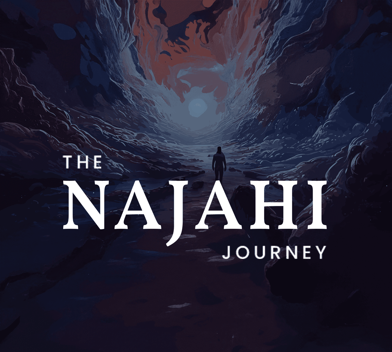
2024 · UAE · Nutrition & Wellness

Kuwa —
Strength Within

My Role Art Director · Marketing Designer · Creative Lead
Client Kuwa — Nutrition & Wellness Brand, UAE
Disciplines
Art Direction Digital Marketing Social Media E-commerce Design Campaign Design

Kuwa is a UAE-based nutrition company with a bold promise — strength within. The brand spans multiple product lines across vitamins, beauty supplements, gut health, and wellness, with two key sub-brands: Nutrili (gummies) and Makalú. The scope: own their entire digital and marketing presence — from e-commerce UI to social campaigns to product launch assets across every channel and format.

2Sub-brands managed simultaneously
3+E-commerce website designs
7+Ad campaigns across formats
20+Creatives across all channels
01

The Brief

Kuwa operates in a crowded wellness market where consumer trust and visual authority are everything. The challenge was to build a cohesive creative system that could flex across wildly different product personalities — gummies aimed at Gen Z shoppers, premium capsule supplements for health-conscious adults, and functional nutrition for performance-focused consumers — while keeping everything unmistakably Kuwa.

01

Multi-Brand Cohesion

Nutrili, Makalú, and Kuwa masterbrand each needed their own voice — but had to read as one family across every touchpoint.

02

Channel Flexibility

Every creative had to work as Instagram story, post, landscape banner, and display ad — same idea, engineered for each format.

03

Speed at Scale

Multiple product launches running in parallel. The system had to make fast execution feel considered — no cut corners visible.

02

Beet It Sport — Keep the Unbeetable Spirit

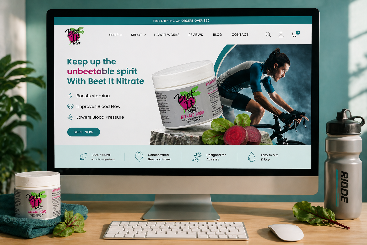
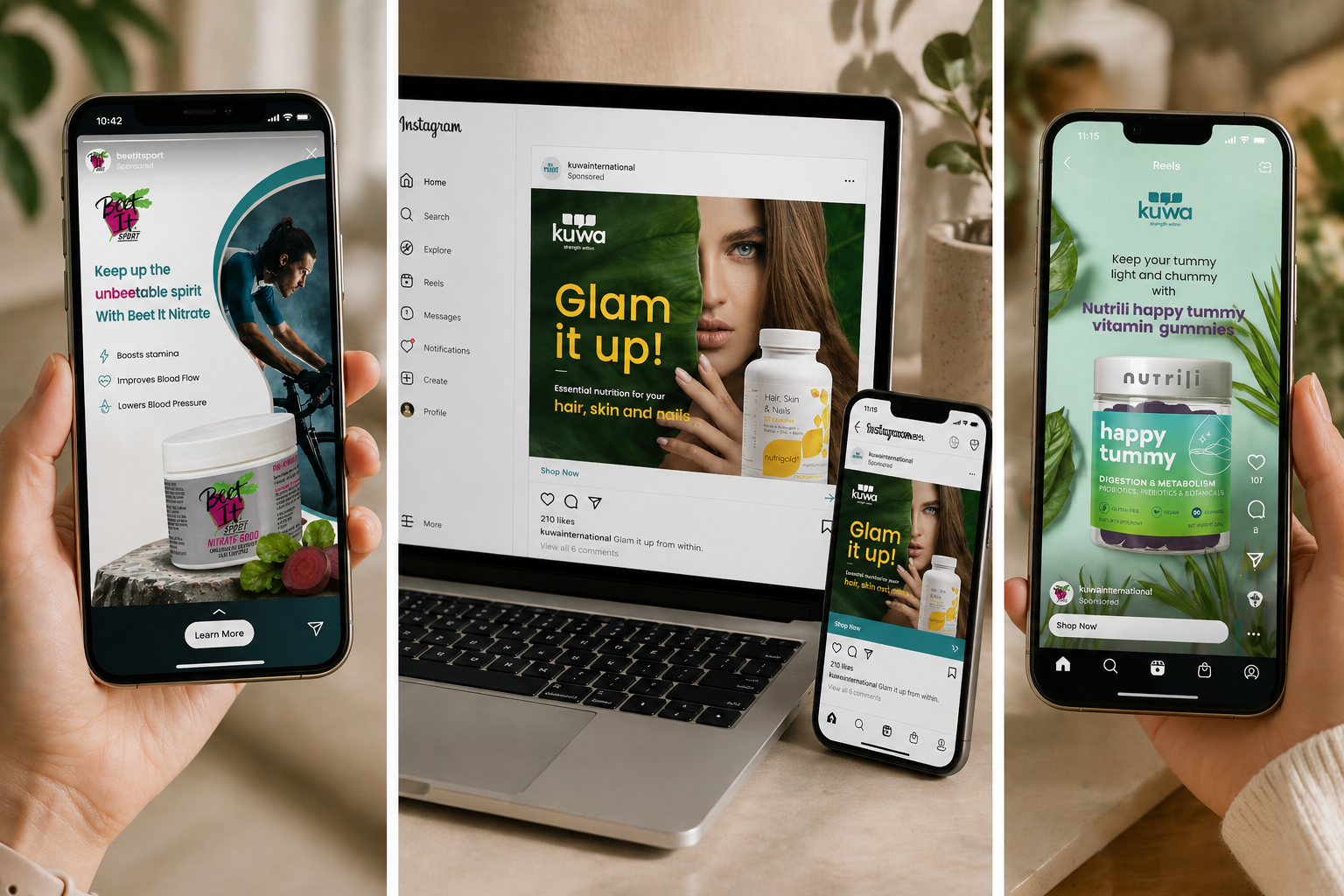
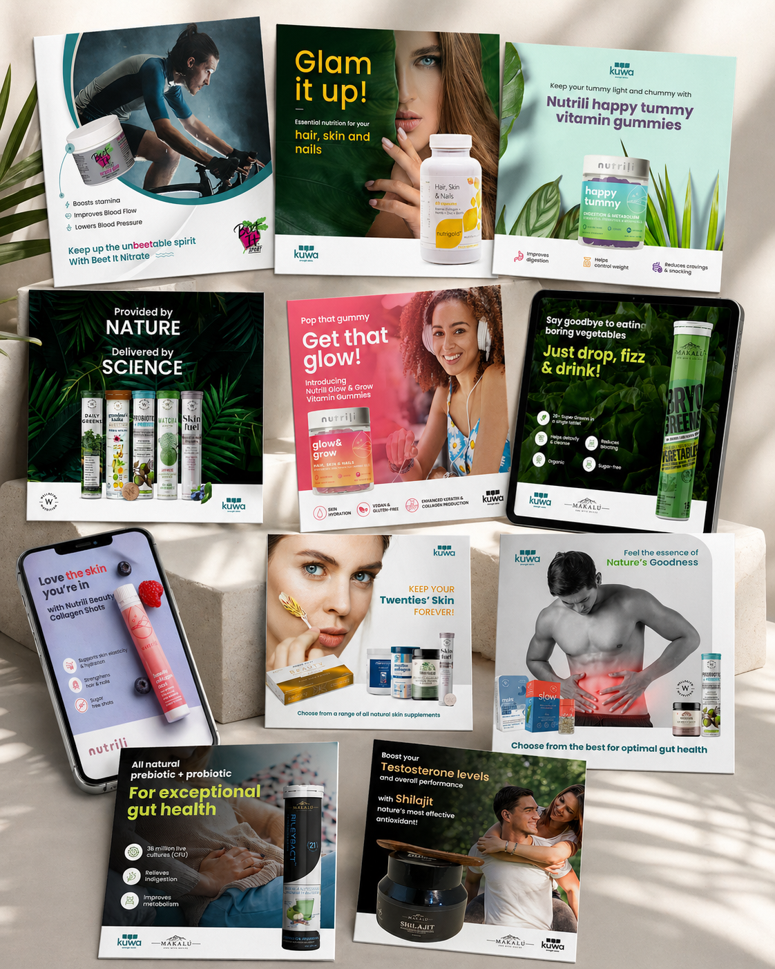
The Beet It Nitrate 8000 campaign needed to feel high-performance and energetic — a cyclist pushing limits, a product that delivers. The e-commerce homepage was designed to land the hero claim fast and drive immediate action, with benefit icons anchoring the clinical credentials below the fold.

Beet It Sport — e-commerce desktop
E-commerce Homepage Hero Banner Design Benefits Iconography Product Launch Campaign
03

Nutrigold — Glam It Up

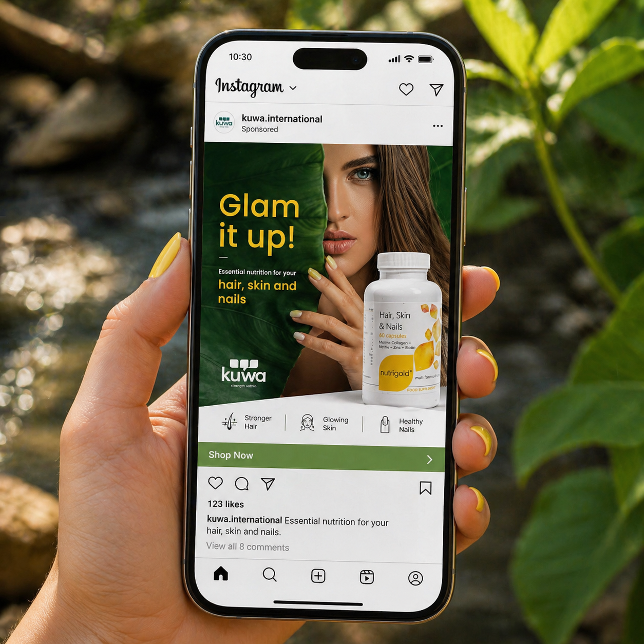
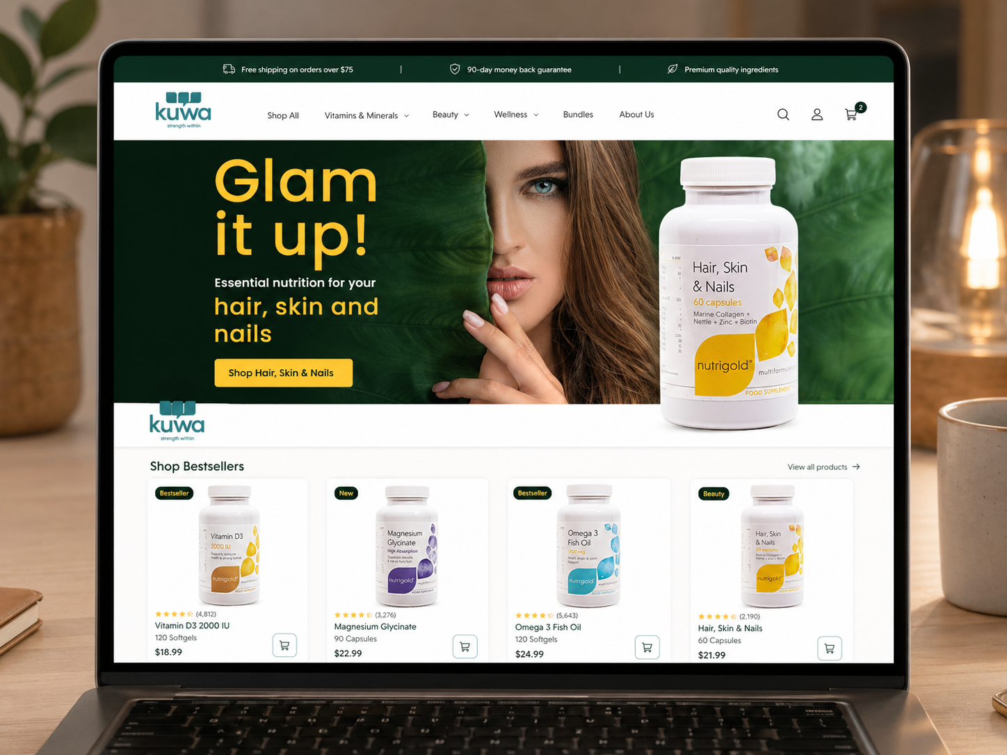
Hair, skin and nails — a category that demands both credibility and aspiration. The Nutrigold campaign anchors on dark forest green for premium trust, with the model half-hidden by a giant leaf — intimate, editorial, unexpected. The same creative ran as a paid Instagram ad and as the e-commerce store hero, proving the system across channels.

Glam It Up — Instagram paid ad on phone
Nutrigold — e-commerce store
Instagram Paid Ad E-commerce Store Design Landscape Banner Post & Story Formats
04

Nutrili Glow & Grow — Get That Glow

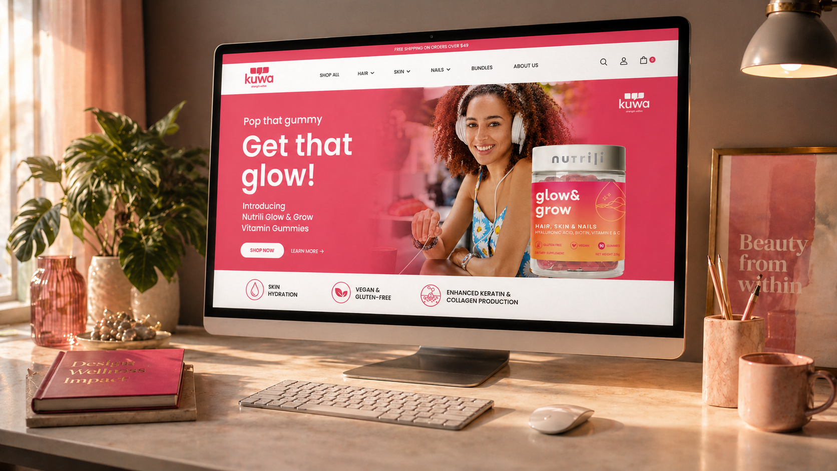
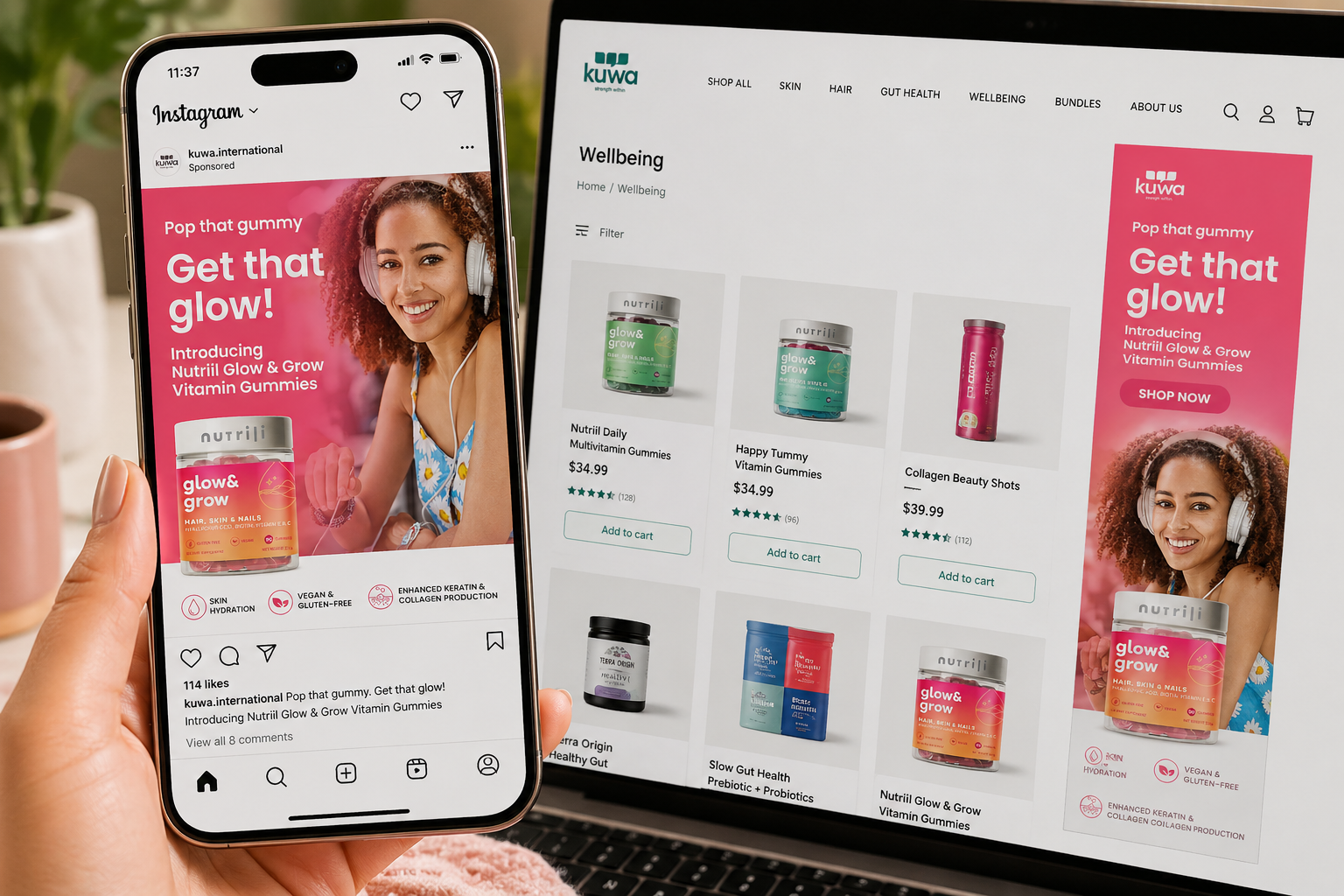
Glow & Grow is Nutrili's hero product — hair, skin and nails in a gummy. The campaign needed to feel vibrant, youthful, and immediate. "Pop that gummy. Get that glow!" does the energy work; the product shot and benefit icons do the conversion work. The creative ran simultaneously as a paid Instagram ad and as the Kuwa e-commerce homepage hero — two completely different contexts, one cohesive visual system.

Nutrili Glow & Grow — Instagram ad on phone and e-commerce desktop
E-commerce Hero Banner Instagram Sponsored Ad Post & Story Formats Product Launch Campaign
05

Nutrili Beauty Collagen Shots — Love the Skin You're In

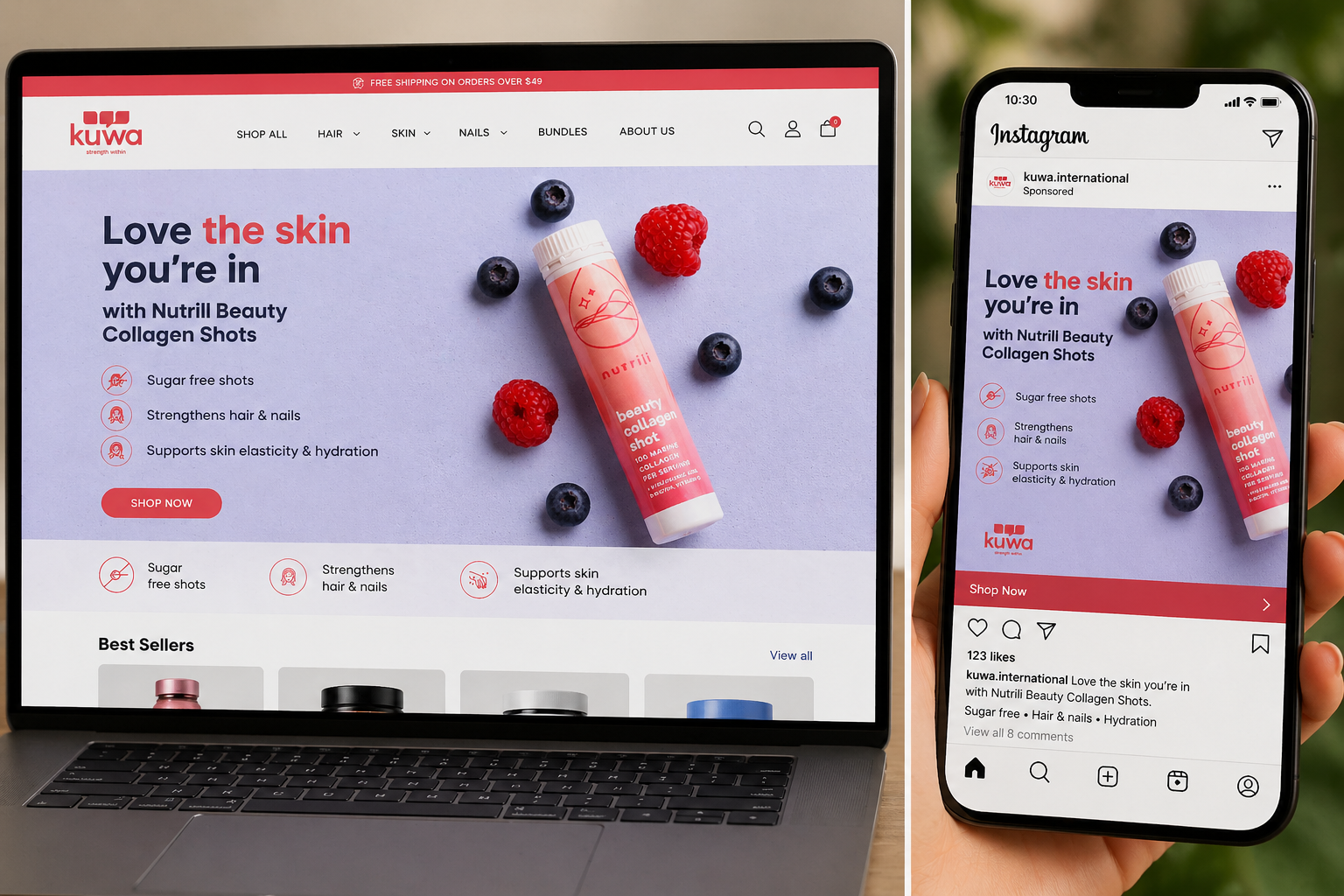
Beauty Collagen Shots demanded a softer register — the lavender-grey backdrop, berry garnish, and hero shot of the tube create something that feels closer to a luxury skincare brand than a supplement. The same creative powered both the e-commerce homepage hero and the Instagram sponsored post, showing how a single well-crafted visual translates across storefront and social without losing any of its impact.

Nutrili Beauty Collagen Shots — desktop and Instagram mockup
E-commerce Homepage Hero Instagram Sponsored Post Story & Post Formats Benefits Iconography
06

Makalú Bryo Greens — Drop, Fizz & Drink

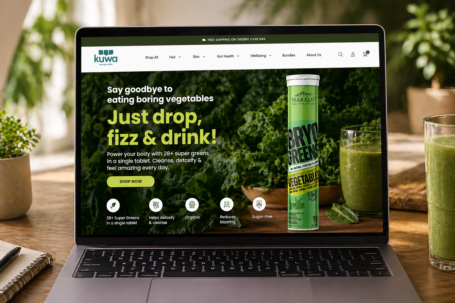
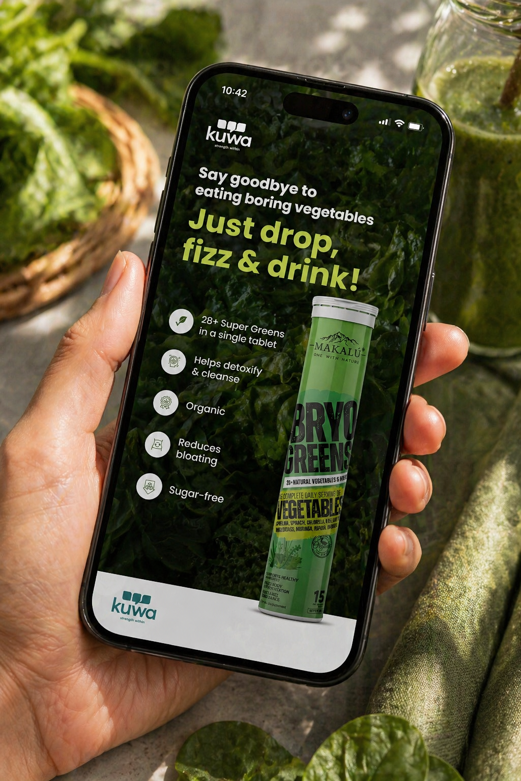
Bryo Greens needed to overcome one consumer barrier: vegetables are boring. The solution was direct and irreverent — "Say goodbye to eating boring vegetables. Just drop, fizz & drink!" Dark green, product-forward, benefit-rich. The campaign was built for both a full e-commerce homepage takeover and a mobile-first Instagram experience — the desktop version landing the full product story, the phone version distilling it to a scroll-stopping moment.

Bryo Greens — e-commerce desktop
Bryo Greens — mobile
E-commerce Homepage Mobile Campaign Landscape & Story Formats Benefit Icon System
07

E-Commerce & Digital Presence

Beyond individual campaigns, the scope covered the full digital ecosystem — three distinct e-commerce storefronts, each with a completely different visual register, all sitting under the Kuwa brand umbrella. Every store was designed from hero banner to product grid, with paid social creatives engineered to match each storefront's aesthetic and drive direct traffic.

Kuwa — grouped digital mockups across campaigns
Kuwa — full campaign collage
Nutrili Store Nutrigold Store Makalú Store Beet It Store Paid Social Ads Multi-format Campaigns
08

What This Proves

Every campaign above looks and feels completely different — different palette, different tone, different product language. That's not inconsistency. That's range. The underlying discipline — one visual idea, engineered across every format, never compromised — is the same across all of them.

Format Intelligence

Each creative was designed natively for its format — not cropped from a master. The phone version of every campaign is a completely different composition to the desktop.

Brand Architecture in Action

Kuwa as masterbrand, Nutrili for gummies, Makalú for premium naturals — three distinct visual identities in one creative system, zero confusion.

Live Market Work

These ran as paid ads and live storefronts in a competitive UAE wellness market. The brief wasn't "make it look good" — it was "make it convert." They did both.

Next Project
Quareb — Brand & Digital Transformation

2023 — 2024 · Dubai, UAE

Quareb — From Broken
to Functioning

My Role Brand Strategist · UX Lead · Art Director · Project Manager
Client Quareb — Arabic Sexual Health Therapy Platform
Disciplines
Business Analysis Brand Strategy Brand Identity UX Research UI Design Copywriting Dev Management Project Management
Live Site quareb.com ↗

Quareb is an Arabic sexual health therapy platform — a sensitive, culturally nuanced space where trust isn't optional, it's the entire product. When I was brought in, the brand didn't communicate that trust, the website actively blocked people from booking, and the technical infrastructure had critical failures in payment and contact. This wasn't a design brief. It was a business rescue — requiring analysis, strategy, design, and delivery management all at once.

3 Core service paths rebuilt from scratch
Higher visits and conversions in service bookings post-launch
0→1 Full brand identity created where none existed
Booking, payment & contact flows fixed and functional
01

What I Inherited

Before any design work could begin, I had to understand the full picture. A platform serving Arabic-speaking users seeking sexual health therapy — a topic that carries significant cultural sensitivity — needs to earn trust from the first pixel. The existing brand and website were doing the opposite.

The Problems

  • Brand identity didn't communicate warmth, safety, or cultural sensitivity
  • Overloaded navigation — users couldn't find what they needed
  • Three core services buried under confusing page structures
  • Booking system had critical failures — users couldn't complete sessions
  • Payment gateway broken — revenue was being lost
  • Contact methods unreliable — leads going unanswered
  • Poor mobile experience for a predominantly mobile audience
  • Visual design that felt clinical and cold — wrong for the subject matter

What I Delivered

  • Complete brand identity — warm, culturally resonant, trustworthy
  • Restructured navigation around 3 clear service paths
  • Homepage rebuilt to surface all services immediately
  • Full booking cycle audited, fixed, and tested
  • Payment gateway issues resolved with developer
  • Contact flow rebuilt and validated end-to-end
  • Mobile-first responsive design throughout
  • Copy strategy aligned with tone of trust and accessibility
02

The Process — End to End

This project required me to wear every hat simultaneously — strategist, researcher, designer, copywriter, and project manager. Each phase fed directly into the next, and I owned the full chain from initial diagnosis through to developer handoff and QA.

01

Business Analysis

Mapped all existing failures. Identified revenue blockers vs. UX issues vs. brand issues. Prioritised the fix sequence.

02

Brand Strategy

Defined positioning, tone of voice, and visual direction. Warm and human — not clinical, not taboo, not over-designed.

03

UX & Copy

Restructured information architecture. Rewrote copy for clarity and cultural sensitivity. Mapped all user flows.

04

UI Design

Designed full visual system — identity, web UI, component library. Delivered precise developer specs.

05

Dev Management

Managed build, QA'd every flow, resolved booking and payment issues directly with the development team.

03

Brand Identity

The name Quareb (قارب) means "boat" in Arabic — a vessel that carries people safely. The identity had to embody that: a safe passage through a sensitive subject. The colour system uses a modern blue for male contexts and a warm mustard-yellow for female — representing balance, connection, and cultural grounding without being heavy-handed.

Logo System Color System Typography Custom Pattern Brand Guidelines Iconography
04

UX Overhaul & Website

The UX strategy was simple in principle, complex in execution: make the three services immediately visible and accessible from the homepage, with zero friction between intent and action. Every page was rebuilt around a single clear purpose. Navigation stripped to what matters. Copy written to reduce anxiety, not add to it.

Information Architecture User Flow Mapping Homepage Redesign Service Pages Therapist Profiles Booking Flow Mobile Responsive Copy Strategy

"It's so much easier to find and book a session now." — User feedback post-launch

quareb.com
Quareb homepage — 3 service paths

Homepage — 3 Service Paths

quareb.com/book-a-session
Quareb booking page

Book a Session

quareb.com/self-learning-programs
Quareb self-help programs

Self-Help Programs

05

Development Management & QA

Design delivery was only half the job. The real test was ensuring the developers built what was designed, and that every user-critical flow worked flawlessly before launch. The booking system, payment gateway, and contact methods each had technical failures that required direct troubleshooting in collaboration with the dev team — not just flagging issues, but diagnosing root causes and driving fixes to completion.

Booking Cycle

Identified multiple failure points in the booking flow. Mapped each step, isolated bugs, and coordinated fixes with developers through multiple test cycles.

Payment Gateway

Payment integration was failing silently. Worked directly with the payment provider and developers to diagnose, configure, and validate the end-to-end transaction flow.

Contact Methods

Contact forms and inquiry routing were broken. Rebuilt the contact architecture, tested all pathways, and ensured zero leads were lost post-launch.

06

Outcome & What This Proves

Quareb went from a platform that was actively losing users and revenue, to one that communicates trust and converts it into bookings. The founders reported higher visits and conversions specifically in service bookings — the single most important metric for the business.

"The new colors and design feel fresh and welcoming." — User feedback post-launch

Not Just a Designer

I diagnosed the business problem before I opened a design tool. That's the difference between decorating a problem and solving it.

Full Cycle Ownership

Strategy → Brand → UX → UI → Dev → QA. I owned every phase and held the quality bar throughout — no hand-off gaps, no delivery surprises.

Business Impact

The measure wasn't whether the design looked good. It was whether the business worked better after. It did.

Next Project